Did SNL’s Tommy Flanagan Oversee the New Surface Temperature Data?
By Bob Tisdale and Anthony Watts, commentary from Dr. Judith Curry follows
There is a new paper published the journal Science about the recent slowdown in global surface warming (released from embargo today at 2PM eastern). It is from Tom Karl and others at NOAA’s newly formed NCEI, National Centers for Environmental Information (a merger of three NOAA data centers: NCDC, NODC and NGDC) and from the government-consulting firm LMI. The lead author is Tom Karl, Director of NCEI and Chair of the Subcommittee on Global Change Research (SGCR) of the U.S. Global Change Research Program (USGCRP). The paper is Karl et al (2015) Possible artifacts of data biases in the recent global surface warming hiatus. “Possible” is obviously the key word in the title.
There is a big push by the American Association for the advancement of Science (AAAS) to promote this paper. Here is what they sent out to press contacts days in advance:
Science Press Package
This information is embargoed until:
2:00 PM U.S. Eastern Time, Thursday, 4 June 2015
Check timezone conversions here.
Please cite the journal Science and the publisher, AAAS, the science society, as the source of this information. Please hyperlink to www.sciencemag.org when publishing online.
Summaries of Articles in the 5 June Science
Evidence Against a Global Warming Hiatus?
An analysis using updated global surface temperature data disputes the existence of a 21st century global warming slowdown described in studies including the latest Intergovernmental Panel on Climate Change (IPCC) assessment. The new analysis suggests no discernable decrease in the rate of warming between the second half of the 20th century, a period marked by manmade warming, and the first fifteen years of the 21st century, a period dubbed a global warming “hiatus.” Numerous studies have been done to explain the possible causes of the apparent hiatus. Here, Karl and colleagues focused on aspects of the hiatus influenced by biases from temperature observation networks, which are always changing. Using updated and corrected temperature observations taken at thousands of weather observing stations over land and as many commercial ships and buoys at sea, the researchers show that temperatures in the 21st century did not plateau, as thought. Instead, the rate of warming during the first fifteen years of the 21st century is at least as great as that in the last half of the 20th century, suggesting warming is continuing apace. According to these and other results, the authors suggest the warming slowdown was an illusion, an artifact of earlier analyses.
Article #16: “Possible artifacts of data biases in the recent global surface warming hiatus,” by T.R. Karl; A. Arguez; B. Huang; J.H. Lawrimore; M.J. Menne; T.C. Peterson; R.S. Vose; H.-M. Zhang at National Oceanographic and Atmospheric Administration (NOAA) in Asheville, NC; J.R. McMahon at LMI in McLean, VA.
The abstract of Karl et al (2015) reads (our boldface):
Much study has been devoted to the possible causes of an apparent decrease in the upward trend of global surface temperatures since 1998, a phenomenon that has been dubbed the global warming “hiatus.” Here we present an updated global surface temperature analysis that reveals that global trends are higher than reported by the IPCC, especially in recent decades, and that the central estimate for the rate of warming during the first 15 years of the 21st century is at least as great as the last half of the 20th century. These results do not support the notion of a “slowdown” in the increase of global surface temperature.
Karl et al expand on that highlighted discussion in the text of the paper (our boldface):
It is also noteworthy that the new global trends are statistically significant and positive at the 0.10 significance level for 1998–2012 (Fig. 1 and table S1) using the approach described in (25) for determining trend uncertainty. In contrast, IPCC (1), which also utilized the approach in (25), re-ported no statistically significant trends for 1998-2012 in any of the three primary global surface temperature datasets. Moreover, for 1998–2014, our new global trend is 0.106± 0.058°C dec−1, and for 2000–2014 it is 0.116± 0.067°C dec−1 (see table S1 for details). This is similar to the warming of the last half of the 20th century (Fig. 1). A more comprehensive approach for determining the 0.10 significance level (see supplement) that also accounts for the impact of annual errors of estimate on the trend, also shows that the 1998–2014 and 2000–2014 trends (but not 1998–2012) were positive at the 0.10 significance level.
THE MISDIRECTION
As shown in their Figure 1 (also our Figure 1), Karl et al. (2015) used the periods of 1951 to 2012 and 1950 to 1999 as references for the recent slowdown in surface warming. The IPCC’s 5th Assessment Report serves as the justification for the early-1950s start point for their reference periods. See Chapter 2 and Chapter 9 of AR5 for the IPCC’s brief mention of the slowdown in global surface warming.

Figure 1
Yet the climate model-based projections of a disaster-filled future global surface warming better align with the warming rate of the recent warming period, which began in the mid-1970s, not 1950. See Figure 2, which uses the GISS Land-Ocean Temperature Index data, because the new NCDC data have not yet been released. Keep in mind there was an earlier hiatus that lasted from the early-to-mid 1940s to the mid-1970s.

Figure 2
If NOAA would like to revise their estimates of future global warming to reflect the more benign warming rate of 0.1 deg C/decade from 1950 to 1999, it would be a big step toward their coming to terms with reality.
We illustrate the ever-growing differences between models and data in the monthly global surface temperature (and lower troposphere temperature) update posts. Figure 3 is the model-data comparison from the April 2015 update.

Figure 3
NEW DATA USED
In many respects, the paper is an introduction to a revised global surface temperature dataset from NOAA. For the oceans, it includes their new ERSST.v4 sea surface temperature data. We discussed that new NOAA sea surface temperature data in the post Has NOAA Once Again Tried to Adjust Data to Match Climate Models? (The WattsUpWithThat cross post is here.)
For the land portion, Karl et al. (2015) state:
Third, there have also been advancements in the calculation of land surface air temperatures (LSTs). The most important is the release of the International Surface Temperature Initiative (ISTI) databank (14, 19), which forms the basis of the LST component of our new analysis. The ISTI databank integrates the Global Historical Climatology Network (GHCN)–Daily dataset (20) with over 40 other historical data sources, more than doubling the number of stations available.
ADJUSTMENTS MAKE MOST OF THE WARMING
NCDC has been in the business of adjusting the surface temperature record for quite some time. The modus operandi so far has been to get a new paper published describing what NCDC considers to be a new and improved dataset, and since NCDC’s articles are often peer reviewed by other government employed scientists at NOAA, they often don’t get a critical peer review. Certainly, based on the reports I’ve received over the years, few if any skeptic scientists have ever been asked to review an NCDC paper on a new global temperature dataset and the techniques involved.
Fortunately, it is very easy to divine such adjustments by comparing the raw data and the final adjusted data, as shown in the graph below. Note how the past gets cooler, centered around 1915 and the present gets warmer.
![NCDC%20MaturityDiagramSince20080517[1]](https://wattsupwiththat.files.wordpress.com/2015/06/ncdc20maturitydiagramsince200805171.gif?w=720&h=389)
Figure 4 Maturity diagram showing net change since 17 May 2008 in the global monthly surface air temperature record prepared by the National Climatic Data Center (NCDC), USA. The net result of the adjustments made are becoming substantial, and adjustments since May 2006 occasionally exceeds 0.1oC. Before 1945 global temperatures are generally changed toward lower values, and toward higher values after 1945, resulting in a more pronounced 20th century warming (about 0.15oC) compared to the NCDC temperature record published in May 2008. Arrows indicate two months where the adjustments over time are illustrated in the figure below. Last diagram update: 19 May 2015. Source: Professor Ole Humlum
Figure 4
On May 2, 2011, NCDC transitioned to GHCN-M version 3 as the official land component of its global temperature monitoring efforts. In November 2011, the GHCN-M version 3.1.0 replaced the GHCN-M version 3. The overall net effect of the transition from GHCN-M version 2 to version 3 is to increase global temperatures before 1900, to decrease them between 1900 and 1950, and to increase temperatures after 1950.
The diagram below exemplify adjustments made by NCDC since May 2008 for two single months (see arrows in diagram above); January 1915 and January 2000.
![NCDC%20Jan1915%20and%20Jan2000[1]](https://wattsupwiththat.files.wordpress.com/2015/06/ncdc20jan191520and20jan20001.gif?w=720&h=649)
Figure 5 Diagram showing the adjustment made since May 2008 by the National Climatic Data Center (NCDC) in the anomaly values for the two months January 1915 and January 2000. Last diagram update 19 May 2015. Source: Professor Ole Humlum
Figure 5
Clearly, with each revision of data, NCDC is making the past cooler and the near present warmer through their adjustment process of the original data. To revisit something said in regards to a previous news story about NCDC’s tendency to adjust data as time goes on, so much so that they can’t even tell us with certainty anymore which month in the past century was the warmest on record, this is still applicable:
“Is history malleable? Can temperature data of the past be molded to fit a purpose? It certainly seems to be the case here, where the temperature for July 1936 reported … changes with the moment,” Watts told FoxNews.com.
“In the business and trading world, people go to jail for such manipulations of data.”
Hold that thought, because NCDC is at it again.
THE IMPACT OF NOAA’S SHIP-BUOY BIAS ADJUSTMENTS DURING THE SLOWDOWN HAVE MADE THEIR NEW SEA SURFACE TEMPERATURE DATASET AN OUTLIER
You’ll note in Figure 1 that the biggest changes between the new and old NOAA data during the global-warming-slowdown periods are in the sea surface temperature data, not the land surface air temperature data. Those adjustments are supposed to be justified by ship-buoy biases. See the quotes in the post Quick Look at the DATA for the New NOAA Sea Surface Temperature Dataset, under the heading of SHIP-BUOY BIAS CORRECTIONS IN ERSST.v4.
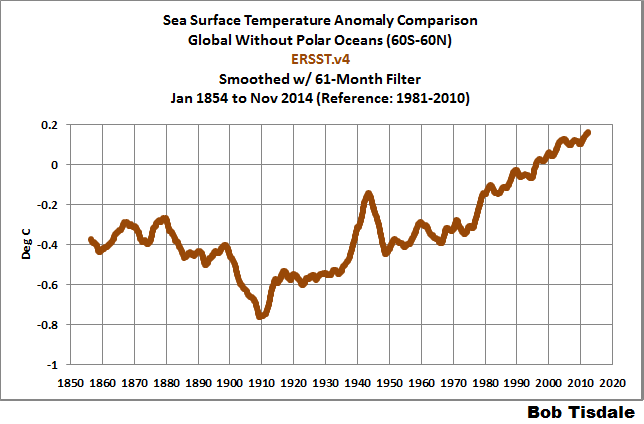
(Note 1: the buoys being discussed are NOT ARGO floats. The buoys used for sea surface temperature measurements are Surface Drifting Buoys and fixed buoys like the TAO Project buoys. Note 2: the latitudes of 60S-60N were used for the following graphs to avoid any differences in how sea ice is accounted for between the datasets and to be consistent with the two papers that introduced the new ERSST.v4 data. Note 3: the trends shown are for sea surface temperatures. They are not directly comparable to the trends discussed by Karl et al. in the second quote, which were for combined land-plus-ocean data.)
THE UKMO HASST3 data have also been adjusted for ship-buoy biases. For the two slowdown periods presented by Karl et al., Figures 6 and 7 compare the HADSST3 and the new NOAA ERSST.v4 data, both of which have been “corrected” for ship-buoys biases, to the older NOAA ERSST.v3b which had not been adjusted for those biases. During both periods, the bias-adjusted HADSST3 data have a much lower trend than the bias-adjusted NOAA ERSST.v4 data. In fact, the bias-corrected HADSST3 data in both cases is more in line with the older NOAA data than the new.

Figure 6

Figure 7
Some might think that NOAA under the direction of Tom Karl designed their ship-buoy bias adjustments with the sole intent of minimizing the impacts of natural slowdown in surface warming. (Those would be some interesting emails and meeting minutes to read.)
And just in case you’re wondering, the new NOAA ERSST.v4 data are compared to the NOAA and UKMO satellite-enhanced sea surface temperature data in Figures 8 and 9.

Figure 8

Figure 9
As noted in the heading, with their new adjustments, NOAA has created an outlier in their new sea surface temperature dataset. Add that to the curious spike in the late-1930s and1940s that can’t be explained by climate models, which were presented in the post here.
BUT THE WARMING RATES OF NOAA’S OLD AND NEW SEA SURFACE TEMPERATURE DATA ARE THE SAME OVER THE PAST 3+ DECADES
The satellite era of sea surface temperature data started in November 1981. Neither of the NOAA sea surface temperature reconstructions (new or old) utilize the satellite-enhanced data. The original version of the NOAA ERSST.v3 data included satellite data when they were first released in 2008, but the satellite data were removed before the dataset became “official” because they did not meet political agenda of the dataset users, which were only NOAA at that time. The revised dataset was renamed ERSST.v3b. It is ERSST.v3b that Karl et al. are calling the “old” data.
But we can learn something very interesting if we compare NOAA’s ERSST.v4 (new) and ERSST.v3b (old) data during the satellite era. See Figure 10.

Figure 10
The warming rates are the same.
But the new data show a much higher warming rate during the “hiatus” periods, and that means…
TO MANUFACTURE WARMING DURING THE HIATUS, NOAA ADJUSTED THE PRE-HIATUS DATA DOWNWARD
If we subtract the ERSST.v3b (old) data from the new ERSST.v4 data, Figure 11, we can see that that is exactly what NOAA did.

Figure 11
Remember the adjusted data from figures 4 and 5 above? Figure 11 uses the same data subtraction method to determine the difference between the original measured data, and the “new and improved”adjusted data courtesy of government-funded science. It’s the same story all over again; the adjustments go towards cooling the past and thus increasing the slope of temperature rise.
Their intent and methods are so obvious they’re laughable.
It’s like John Lovitz Saturday Night Live character “Pathological liar”, Tommy Flanagan was in charge.
Gee, we need to show more sea surface warming during the hiatus, but we don’t want to increase the trend since about 1982.
 It’s hard to imagine how anyone could take the new NOAA global surface temperature data seriously.
SEA SURFACE TEMPERATURE DATA SOURCE
The sea surface temperature data presented in this post are available from the KNMI Climate Explorer.
Comments from Georgia Tech Climatologist Dr. Judith Curry:
The greatest changes in the new NOAA surface temperature analysis is to the ocean temperatures since 1998. This seems rather ironic, since this is the period where there is the greatest coverage of data with the highest quality of measurements – ARGO buoys and satellites don’t show a warming trend. Nevertheless, the NOAA team finds a substantial increase in the ocean surface temperature anomaly trend since 1998.
In my opinion, the gold standard dataset for global ocean surface temperatures is the UK dataset, HadSST3. A review of the uncertainties is given in this paper by John Kennedy http://www.metoffice.gov.uk/hadobs/hadsst3/uncertainty.html. Note, the UK group has dealt with the same issues raised by the NOAA team. I personally see no reason to the use the NOAA ERSST dataset, I do not see any evidence that the NOAA group has done anywhere near as careful a job as the UK group in processing the ocean temperatures.
I am also unconvinced by NOAA’s gap filling in the Arctic, and in my opinion this introduces substantial error into their analysis. I addressed the issue of gap filling in the Arctic in this recent publication: Curry JA, 2014: Climate science: Uncertain temperature trends. Nature Geoscience, 7, 83-84.
Relevant text:
Gap filling in the Arctic is complicated by the presence of land, open water and temporally varying sea ice extent, because each surface type has a distinctly different amplitude and phasing of the annual cycle of surface temperature. Notably, the surface temperature of sea ice remains flat during the sea ice melt period roughly between June and September, whereas land surface warming peaks around July 1. Hence using land temperatures to infer ocean or sea ice temperatures can incur significant biases.
With regards to uncertainty, in their ‘warmest year’ announcement last January, NOAA cited an error margin in the global average surface temperature anomaly of 0.09oC. The adjustments to the global average surface temperature anomaly is within the error margin, but the large magnitude of the adjustments further support a larger error margin. But they now cite a substantially greater trend for the period 1998-2014, that is now statistically greater than zero at the 90% confidence level.
My bottom line assessment is this. I think that uncertainties in global surface temperature anomalies is substantially understated. The surface temperature data sets that I have confidence in are the UK group and also Berkeley Earth. This short paper in Science is not adequate to explain and explore the very large changes that have been made to the NOAA data set. The global surface temperature datasets are clearly a moving target. So while I’m sure this latest analysis from NOAA will be regarded as politically useful for the Obama administration, I don’t regard it as a particularly useful contribution to our scientific understanding of what is going on.


![NCDC%20MaturityDiagramSince20080517[1]](https://wattsupwiththat.files.wordpress.com/2015/06/ncdc20maturitydiagramsince200805171.gif)
![NCDC%20Jan1915%20and%20Jan2000[1]](https://wattsupwiththat.files.wordpress.com/2015/06/ncdc20jan191520and20jan20001.gif)


 ENLARGE
 ENLARGE


 RSS
RSS RSS
RSS RSS
RSS


You must be logged in to post a comment.